30 Jul 2012

Textures - some sort of weird introduction

Recently I've been thinking about texturing that imitates fabrics on miniatures (due to my two beautiful Pegaso boys). Which scale is big enough to give it a try, to make it look natural, not only to show off.
Should we do that while painting miniatures up to 90mm, or maybe only bigger? Does it look realistic, or not really?
Sure, when it's done right it looks pretty awesome (for a freehand), shows the skill and dedication of the painter (you know, all these long hours he/she spent painting all the tiny lines). But is it necessary and believable?
Does it add more realism to the mini, or maybe is a bit over the top? I must say I do have my doubts, but still didn't make my mind.

Let's think about it for a moment, and look at some pictures:

Here are some close-ups of contemporary fabrics and photos of clothes made of them.


Silk


Wool


Linen


Velvet


I don't think threads of any of these fabrics would be visible even in scale 1:20. Well maybe except of thickest wools and roughest  linen. And of course old and crumpled velvet, but that's completely different thing.


But you may say: it's all contemporary fabrics, made by fancy machines. And what about old times?


Personally I don't really think it was that much different from now. Of course the technology of weaving, and used tools were different, but let's give some credit to our ancestors. Even in the middle ages people were able to weave some fine and delicate fabrics. 

Quoting Vikings Online:
 "The Vikings were not the barbarians that our Victorian forefathers imagined, so extremely coarsely woven cloth such as sack cloth, is not required for clothing. 10 threads per centimeter was average, whilst 60 threads per centimeter was not uncommon for extremely fine material." Source

Let's do the math:
10 threads per 1 cm, 1mm thick thread, and
in scale:
- 1:10 it's 1/10mm thick single thread,
- 1:20 it's 1/20mm thick single thread,
- 1:35 it's 1/35mm thick single thread. 


And that's the thick wool... Made by Vikings. How much better should it be on royal courts in more developed parts of the world?

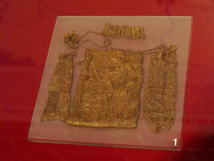
Here are some examples of real medieval fabrics found in archeological excavations.

silk brocade

silk
source


wool
source

As you can see it's not that primitive and thick as we could imagine.

Looking only from that point of view, all attempts to recreate a fabric on a mini smaller than 1:10 is kinda pointless. Try to imagine how extremely thick would it be when increased to the real size...
Silly, isn't it??:>

But on the other hand....
Textured fabrics, if done properly, and not on every single piece of clothing, definitely add some visual interest to the mini (even if it hurts a little when we think about the 'real' thickness of the painted fabric).
After all, the contrast we build on a mini is way out of proportion to the real life, but it helps to show three-dimensional of the mini.
So maybe textured fabrics, if done with some sense, may be a really nice addition to the mini and not only show off?
I really don't know;p  I'll probably try at some point just to prove myself that I can do that good enough. And even said that, I don't think I'd ever dare to 'recreate' threads of silk or other delicate fabrics or on clothes of nobility and kings, but maybe on a woolen cloak it wouldn't be too bad?

And there is one more aspect of this textured affair...
Maybe it's only a temporary trend to paint fabric's threads everywhere it's possible, just to push the border of what's possible in this hobby a little bit further? Maybe it will pass at some point and we'll all get back to the smooth painting?


How do you think?
Am I making mountains out of molehills, or do we have a topic for valid discusion?


cheers


'eM


26 Jul 2012

Pegasus Project - Templar's shield, update

I've been working on the Templar's shield yesterday. 
Still lots to do, but I think it's going into the right direction.


At this point I'm really happy with the way the front of the shield is turning out. I'm not an expert on randomness. I find it tricky to do random stains and blemishes and avoid creating patterns. But I guess after adding some blood it should look good.

And here are few close-ups, to show you the texture of dirt and damage on the shield's front, and wood grain at the back.


I know you can see all the little imperfections (not so little too;p), but please bare in mind, that these are some extreme close-ups.  The shield is more or less 6,5 cm long, so most of the flaws will disappear, while looking at the miniature as a whole.

But if you have any ideas how I could improve the shield, please do not hesitate. All criticism and comments will be highly appreciated. I want this piece to be my best:)


cheers

'eM

23 Jul 2012

Medusa on her way and shopping ban

Few weeks ago I decided, that I need to stop buying new miniatures for now... It was hard, very hard... but I was strong! And managed to last in this decision for a week, two weeks tops;p

And then, I bought this lovely lady - Gorgon Medusa.

Beautiful bust sculpted by Allan Carrasco and available through Lugdunum Figurines Club.
It should be with me sometime next week and I must admit I can't wait. I do love that thrill  when I take new mini from the box for the first time.

But I know that I need to stop, seriously!!
Well, at least for now;p
At least till September 22nd!!
And then I'll probably go nuts:D Buying all those beautiful miniatures I won't be able to resist.
So dear vendors during EuroMilitaire, bevare!! I'll be there!!

cheers

'eM


22 Jul 2012

To WIP or not to WIP

Recently I've been thinking about my WIP photos. About how rarely they look any good.
I must admit I'm quite messy painter, and I tend to work on all parts of the mini almost simultaneously, so most of the time my miniature look kinda messy with all these sharp edges between lights and shadows, unfinished parts and missing elements. Sometimes it's even hard to tell what is ready for evaluation and what's just the base colours.

Here are some of my examples:


Maybe I'm doing myself more harm than good publishing WIP photos, maybe it would be better not to show them at all? Publish only finished pieces?

And what's your opinion about WIPs? Do you post them for your own works, or rather not? Do you like to watch how works of other painters are developing in time?

cheers

'eM

21 Jul 2012

From Hall of Shame to Hall of Fame

Yay!! I managed to finish one of the minis from Hall of Shame!!
 
I must admit, this one was fairly easy, as I did most of the painting almost a year ago, and put it on the side because I lost all my heart for this mini. I was hoping that at some point it will pass and I'll be able to finish it.
Sadly it didn't, so I decided to fix the biggest issues (like the missing shadow under the mini) and put it on the shelf with other finished miniatures.

So here he is, Marquis de Carabas
from the SMOG, a Victorian Fantasy range by Smart Max.


If you're interested how I did the base, you can check my articles about candles and bones.


cheers,

'eM


20 Jul 2012

Pegasus Project - time for the Viking

Few more elements of the Viking are close to completion.


This time I was working on:
- the metal parts, the helmet and hauberk (at least from the front, the back will be hidden behind the cloak). Not sure yet if they're ready or not. Maybe I'll have to push the contrast a bit more, or add more battle damage on the helmet.
- belts and other leather parts (except of the shoes). As usual I'm quite happy with how they turned out, but it's nothing special, simply worn belts with a lot of damaged edges and surfaces.
- gambison (this quilted thingy between his shirt and hauberk). To be honest I was going for cold shade of red with this element, and as you can see it turned more purple than red, but I think I can live with that. It's not exactly natural shade of red and I couldn't find it on the picture of medieval shades used by Vikings (after www.vikingsonline.org.uk) but I read on the same page that pink was fairly common, so I should be ok with the historical truth.
- shirt, for now it's simply white (or rather white-ish, as pure white clothes were very expensive in the middle ages) but I'm thinking about adding a freehand at the bottom. Something rather simple, just to accent this boring part.
-trousers. I still can't make the decision whether I want them more blue or gray. But this part needs lots of work anyway, so I can change the hue easily.


The other thing I'm not sure about are tapes around his trousers. I guess red is not the best colour here, so I need to repaint it. But should I paint it offwhite, any other colour, or maybe do the freehand to imitate braids used by the Vikings? Something like on the pictures below?


What do you think?

cheers

'eM

11 Jul 2012

Pegasus Project - some more painting

Some  more photos of the Pegasus Project. Thist time mostly Templar.

Everything still more sketchy than being close to be ready. Well maybe except of the face and leather elements.
 

And that's the only pieces of the Viking painted so far.
Not much, I know. Maybe I'll try to do skin today.

cheers

'eM